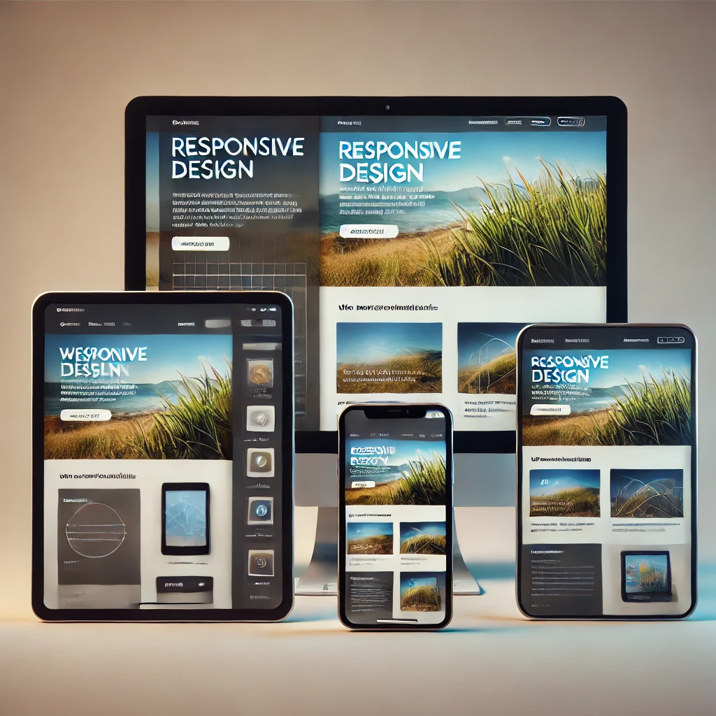
With more than half of web traffic coming from smartphones and tablets, your website must adapt to every screen size—or risk losing customers before they even scroll. Here’s why investing in responsive design pays dividends for your small business:
1. Superior User Experience
When visitors land on a site that auto‑adjusts—whether they’re on a 6‑inch phone or a 27‑inch monitor—they stay longer and explore more. A layout that flexes to fit any display means no pinching, no sideways scrolling, and no frustration.
2. Better Search Rankings
Google’s algorithm rewards mobile‑friendly sites. If your pages resize cleanly and load quickly on handheld devices, you’ll climb search results—and that’s free, targeted traffic for your business.
3. Increased Conversions
A consistent experience across devices removes barriers to purchase. Customers who can easily navigate your product pages, fill out forms, or complete a checkout on any device are far more likely to buy—and become repeat buyers.
4. Cost Efficiency
Maintaining a single responsive site is far cheaper than building and updating separate desktop and mobile versions. You cut development time, hosting fees, and the headache of synchronizing content across platforms.
5. Future‑Ready Flexibility
New devices with novel screen sizes emerge every year. Responsive frameworks automatically adapt to these changes, so your site stays sharp on foldables, wearables, or whatever’s next—without a full redesign.
6. Unified Brand Experience
Responsive design ensures that your logo, colors, fonts, and messaging remain consistent—no matter how customers reach you. That uniformity strengthens trust and reinforces your brand identity at every touchpoint.
In today’s competitive landscape, a static, desktop‑only site simply won’t cut it. By embracing responsive design, you guarantee that your small business website meets users wherever they are—driving engagement, boosting SEO, and ultimately, growing your bottom line.